Creating an Image Crop Tool with Tina
Tuesday, December 23, 2025If you've had to change you Facebook cover photo recently you've probably dealt with Facebook's cover photo limitations. Facebook recommends a cover photo size of 820x312 pixels and anything that doesn't fit those precise dimensions gets cropped. Thankfully Facebook has a neat built in tool that allows you to position cover photos so that the even if it doesn't fit these dimensions you can frame it perfectly.
When I first saw this I had a couple of thoughts. The first of which was how can I position my cover photo perfectly enough that people will be impressed think I'm a photographer? The second thought I had was how can I pull something cool like this off on my blog site? Well with a bit of fiddling around I managed to pull it off, so in this blog post I'll show you how to set up your own image crop tool with TinaCMS.
Setting up the project
For this tutorial we'll be using the TinaCMS Next.js starter as a base. We'll be using version 1.6.1 of the starter. As much as I love the teams enthusiasm, having the Tina starter go through complete design overhauls every few months makes it difficult to keep this tutorial up to date. Run the command below to get started.
npx create-tina-app@1.6.1When prompted to choose a starter template choose the Next.js Starter. It comes with Tailwind 4 preinstalled and the ShadCN CLIalready set up. This will come in handy later when add a couple of components to Tina editor to make tweaking the image a bit more fun.
Adding the Components
Once you've got your project all set we'll start adding the necessary components to the project. The first component we'll add is the most important, we want a new Smart Image component that lets us customize the image for better framing.
// components/smart-image.tsx
import { cn } from "@/lib/utils";
interface SmartImageProps {	"data-tina-field"?: string;	zoom: number;	yOffset: number;	alt: string;	src: string;	className?: string;}
const SmartImage = ({	zoom,	yOffset,	alt,	className,	src,	...props}: SmartImageProps) => {	return (		<div {...props} className={cn("relative overflow-hidden", className)}>			<Image				priority={true}				src={src}				alt={alt}				style={{ scale: zoom / 100 }}				fill				objectFit="cover"				objectPosition={`center ${yOffset + 50}%`}			/>		</div>	);};
There are 2 main styling elements at play here:
- We're using the
objectFitproperty to ensure the image always scales to the full size of it's container. TheobjectPositionproperty is being used to stretch the image horizontally to he width of it's container, then we're using a Y offset to change where the image sits if it spills over. - the
scaleproperty is a transform property. Transform properties apply after the image has been positioned otherwise. We're using it to make the image larger and then crop anything than spills out of the container usingoverflow-hidden. This creates the illusion of a crop.
Tina Field Components
Now that we've got our smart image set up we'll add a few components for the Tina editor to make tweaking the image a bit more fun and easy.
Running the command below should command should add a ShadCN component to your repo. The Tina starter comes with the ShadCN already set up so we don't need to do this on our end.
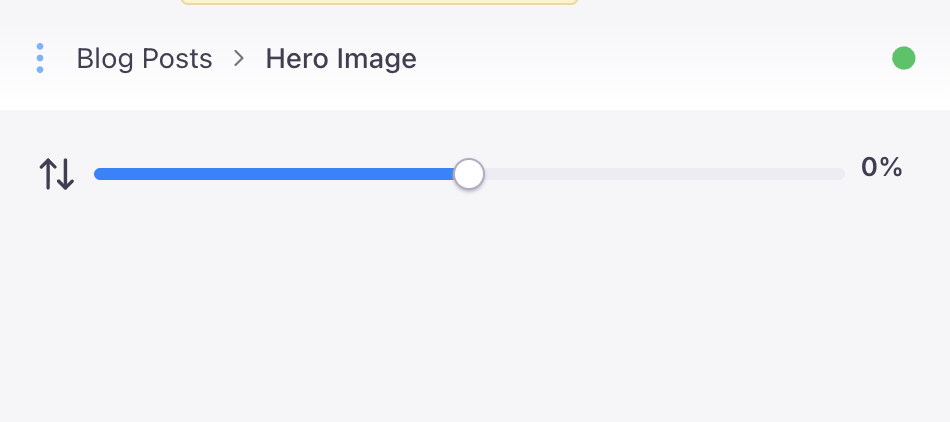
pnpm dlx shadcn @latest add sliderNow we'll add a wrapper component around the ShadCN slider. The default slider returns an array so that you can have more than 1 thumb for the slider. Because we're only dealing with 1 thumb we'll just emit the first value. I've also added a bit of padding around the top and bottom, a percentage indicator, and some arrow to indicate the slider will position the image along the Y axis.
// tina/fields/image-slider.tsx
import { Slider } from "@/components/ui/slider";import { ArrowUpDown } from "lucide-react";import React from "react";
interface ImageSliderProps {  value: number;  onValueChange: (value: number)=> void;  max?: number;  min?: number;}
const ImageSlider = ({value, onValueChange, ...props}: ImageSliderProps) =>{    return (    <div className='flex mb-5 gap-2 font-sans text-xs font-semibold text-gray-700'>      <ArrowUpDown />      <Slider        value={[value]}        onValueChange={(e)=> onValueChange(e[0])}        {...props}        /> {Number(value)}%    </div>    )}
export default ImageSlider;
After that's all said and done we'll have a slider component that looks like the image below. We'll be able to see it later once we've added the field to our schema for Tina.
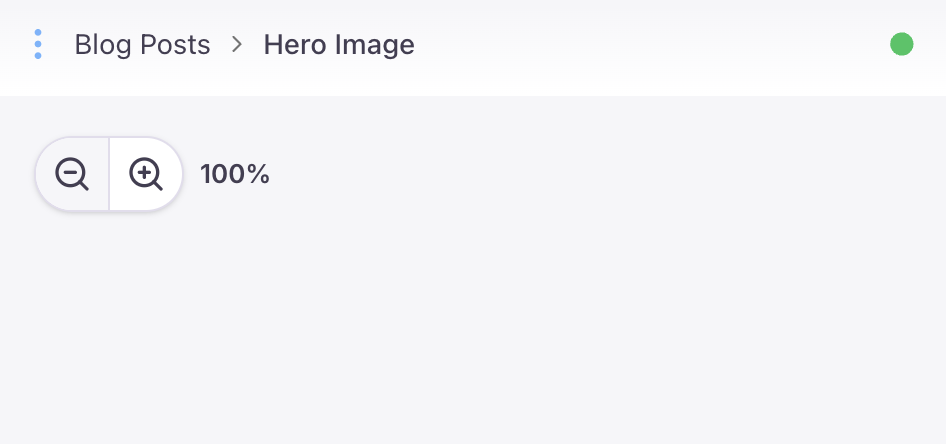
The final component we'll be adding for the Tina form we'll be a stylish combo button for zooming in and out of the image incremenally.
// tina/fields/zoom-button.tsx
interface ZoomButtonProps {	value: number;	onValueChange: (value: number) => void;	max: number;	min: number;}
const ZoomButton = ({ value, onValueChange, max, min }: ZoomButtonProps) => {	return (		<div className="font-sans text-xs font-semibold text-gray-700 flex mb-5 items-center gap-2">			<div className="border bg-white overflow-hidden divide-x shadow rounded-full flex flex-row divide-gray-200  w-fit border-gray-200">				<button					onClick={() => onValueChange(value - 5)}					disabled={value <= min}					className="p-2 transition-colors outline-0 enabled:hover:text-blue-500 disabled:bg-gray-50 hover:bg-gray-50"				>					<ZoomOut className="size-5" />				</button>				<button					className="p-2 transition-colors outline-0 enabled:hover:text-blue-500 disabled:bg-gray-50 hover:bg-gray-50"					disabled={value >= max}					onClick={() => onValueChange(value + 5)}				>					<ZoomIn className="size-5" />				</button>			</div>			{value}%		</div>	);};
export default ZoomButton;
The button itself will look like this once we're done.
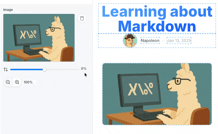
Updating the Schema
With all of our components set up we're ready to roll. We'll need to add a few extra configuration options to our schema to allow the image dimensions to be tweaked. Make note of the fact that we're changing the type of the hero image field from image to object. Tina's versatile enough to just ignore and replace the existing images we have saved in our markdown, but we will need to re-upload the images for our blog posts.
// tina/collection/post.tsx
+ import ZoomButton from '../fields/zoom-button';+ import ImageSlider from '../fields/image-slider';
// ...
{- type: 'image',+ type: 'object',  name: 'heroImg',  label: 'Hero Image',  // @ts-ignore  uploadDir: () => 'posts',+ fields: [+   {+     type: 'image',+     name: 'img',+     label: 'Image',+   },+   {+     name: 'yOffset',+     type: 'number',+     label: 'Y Offset',+     ui: {+       component: ({input})=> {+         return (+           <TinaSlider+             value={input.value || 0}+             min={-50}+             max={50}+             // @ts-ignore+             onValueChange={input.onChange} />+         )+       }+     },+   },+   {+       type: 'number',+       name: 'zoom',+       label: 'Zoom',+       ui: {+         defaultValue: 100,+         component: ({input})=> {+           const value = input.value || 100;+           return <ZoomButton+             value={value}+             min={100}+             max={200}+             // @ts-ignore+             onValueChange={input.onChange} />+         },+       },+     },  + ],},
// ...
Updating the Page
Lastly we'll replace the nice glowing image from the Tina starter with our banner. We'll be locking the image dimensions to 16:9 for a couple of reasons:
- It keeps the overall look and feel of the blog consistent.
- It prevents Cumulative Layout shifts from happening when the images for our blog posts load.
// app/posts/[...urlSegments]/client-page.tsx
// ...
- {post.heroImg && (+ {post.heroImg?.img &&   <div className='px-4 w-full'>- <div data-tina-field={tinaField(post, 'heroImg')} className='relative max-w-4xl lg:max-w-5xl mx-auto'>-   <Image-     priority={true}-     src={post.heroImg}-     alt={post.title}-     className='absolute block mx-auto rounded-lg w-full h-auto blur-2xl brightness-150 contrast-[0.9] dark:brightness-150 saturate-200 opacity-50 dark:opacity-30 mix-blend-multiply dark:mix-blend-hard-light'-     aria-hidden='true'-     width={500}-     height={500}-     style={{ maxHeight: '25vh' }}-   />-   <Image-     priority={true}-     src={post.heroImg}-     alt={post.title}-     width={500}-     height={500}-     className='relative z-10 mb-14 mx-auto block rounded-lg w-full h-auto opacity-100'-     style={{ maxWidth: '25vh' }}-   />- </div>+ <SmartImage+   data-tina-field={tinaField(post, 'heroImg')}+   src={post.heroImg.img}+   className='mb-14 aspect-video w-full lg:max-w-5xl mx-auto rounded-lg'+   alt={post.title}+   yOffset={post.heroImg.yOffset || 0}+   zoom={post.heroImg.zoom || 100} />  </div>)}
// ...
After you've completed the steps above you should have a nice image field in the blog post editor.

Written by Caleb Williams
Come and chat to me on LinkedIn!